Avora is a skincare brand I created around a simple idea: a little care should be easy to understand and enjoyable to shop for. I designed the brand and built its online store with Next.js, React and TypeScript, so the website, the packaging and the product imagery all share one identity. This case study walks through every part of the store, and what it means if you are planning an ecommerce website of your own.
The challenge: an expressive brand that is still easy to shop
A beauty brand wants to look calm and distinctive. A shop needs people to find a product, compare it, read the details and reach checkout without getting lost. The goal on Avora was to do both at once.
My scope covered the brand identity, UI/UX design, product presentation, motion and the Next.js build. The result is a 16-product collection in two categories, with product education, favourites and a three-step checkout. This is a self-initiated project, so the decisions come from the project goals and not from formal customer research.
One recognisable brand system
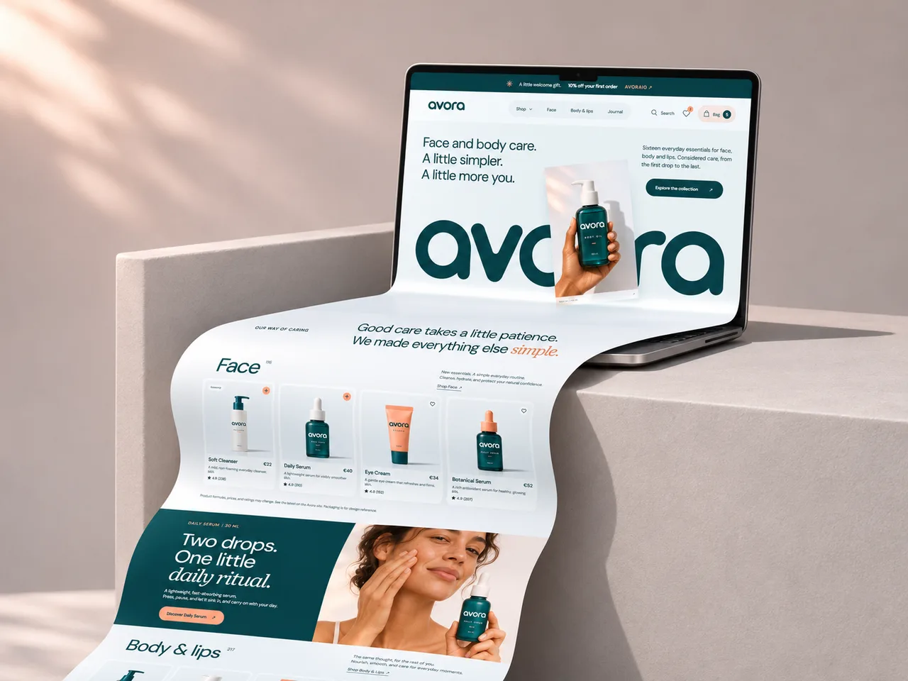
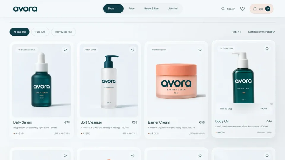
The palette has three colours: ice white, deep teal and soft peach. Teal carries the wordmark and the type, and peach is kept for small warm accents. The rounded Avora wordmark appears on the site and on every product mockup. Soft glass cards, pill-shaped navigation and generous spacing give the interface the same character on every page, so the collection reads as one brand and not as separate product listings.
Easier product discovery
The catalogue is split into Face (nine products) and Body & lips (seven). Shoppers can narrow it in four ways:
- Category tabs for all care, face, and body and lips, each showing its product count
- Filters by product type and price
- Sorting by recommended, price, most loved and top rated
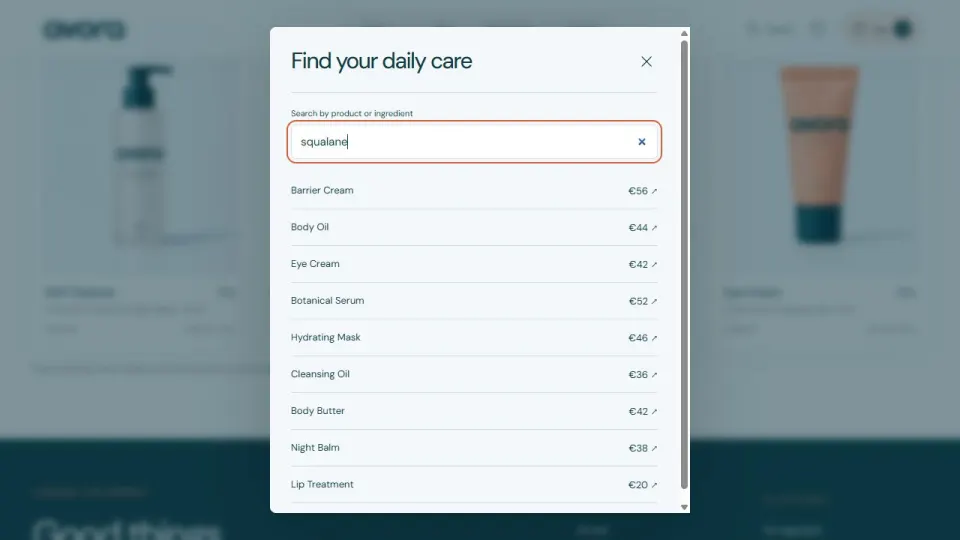
- Search by product or ingredient: typing "squalane" lists every product that contains it
Quick-add buttons on each card save a trip to the product page, and a heart saves an item to favourites for later.
Product pages that answer questions
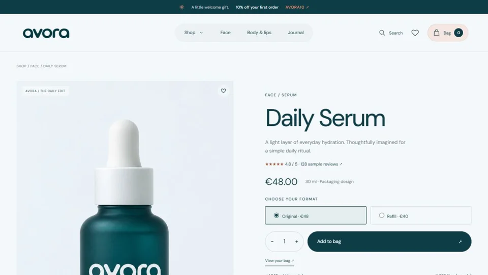
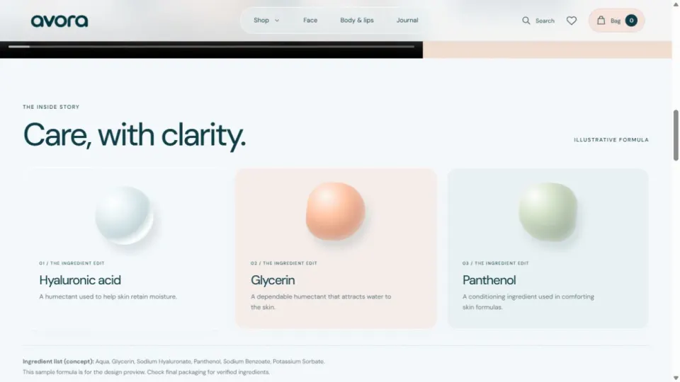
Each product page shows packaging and lifestyle views next to the price, the size, a quantity control and a choice between the original and a refill. Below that are usage instructions, ingredient cards that explain what each ingredient does in one line, and a sample ingredient list. Supporting details sit in accordions, and related products give the visitor a way to build a routine.
Reviews designed for trust and feedback
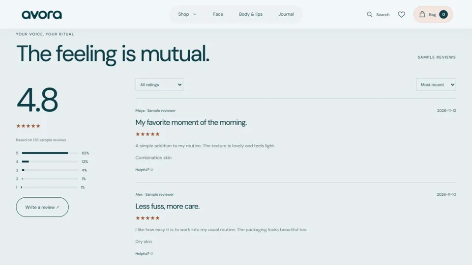
The review section has a rating summary, rating filters, sorting and "helpful" controls, and a review form gives customers a clear place to leave a star rating and a comment. Ratings, sales and like counts near each product show how social proof would sit in the layout.
The reviews and counts on the site today are samples, and are labelled that way. A new review is saved only in the visitor's own browser. A shared review service is a later step.
A welcome offer and a place for email
A one-time welcome offer and the announcement bar introduce 10% off the first order with the code AVORA10. The offer appears once per browser and can be reopened from the top bar. The footer has a newsletter signup, so the brand has a visible place to start an ongoing relationship. The form is a design for now: the site does not save email addresses or send campaigns until it is connected to an email platform.
A guided path from bag to checkout
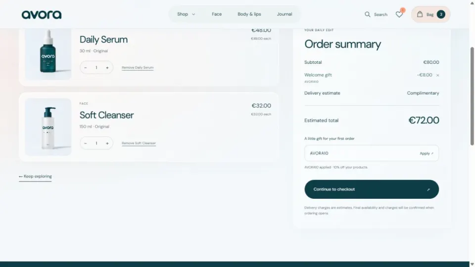
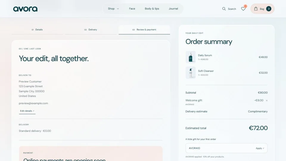
The bag supports quantity changes, removal, the coupon and clear estimated totals. In the example below, two products come to €80, the welcome code takes off €8 and the estimated total is €72. Checkout then has three steps: Details, Delivery, and Review & payment.
Favourites and bag contents are kept between visits, so a shopper can come back to their selection. I tested the flow to the final review step with made-up details. Live payments and order submission are not switched on, and the final button says so plainly instead of pretending an order went through.
Mobile, motion and the journal
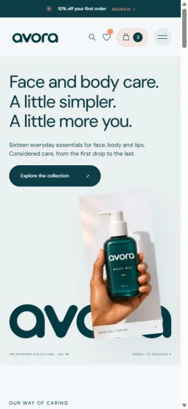
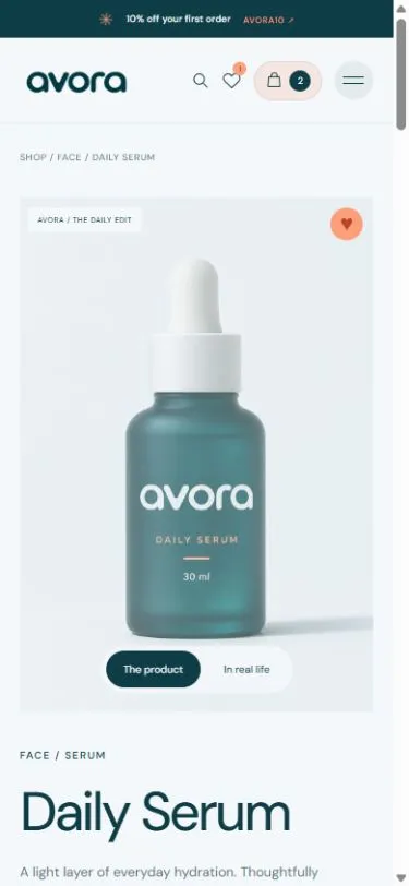
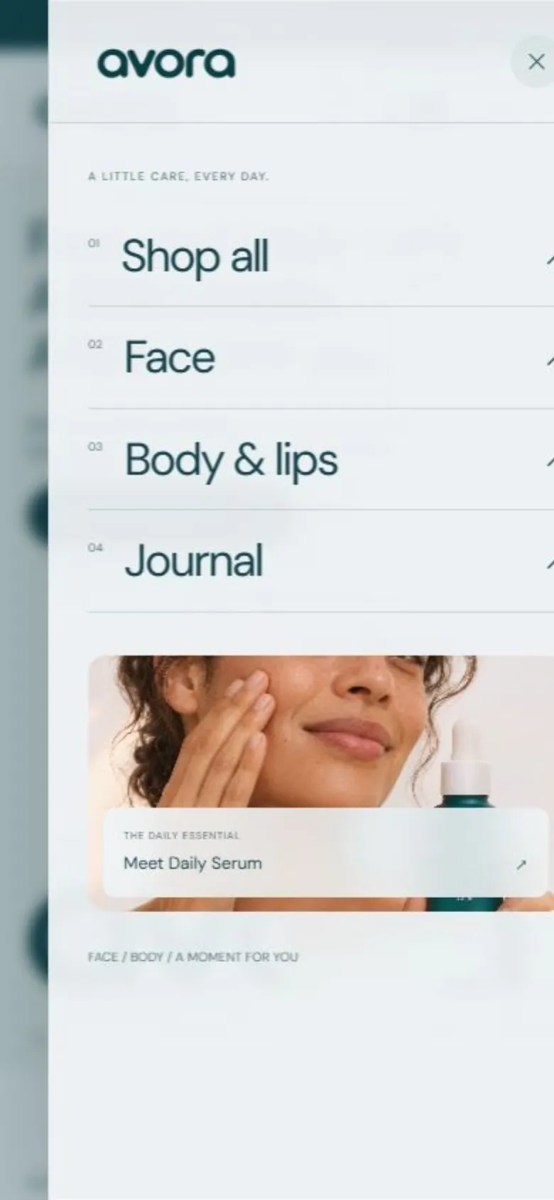
Most shopping happens on a phone, so every page was designed for a small screen and not only shrunk to fit. The header keeps search, favourites and the bag one tap away, the menu opens full screen with large links, and the product page puts the photo and the "add to bag" button first.
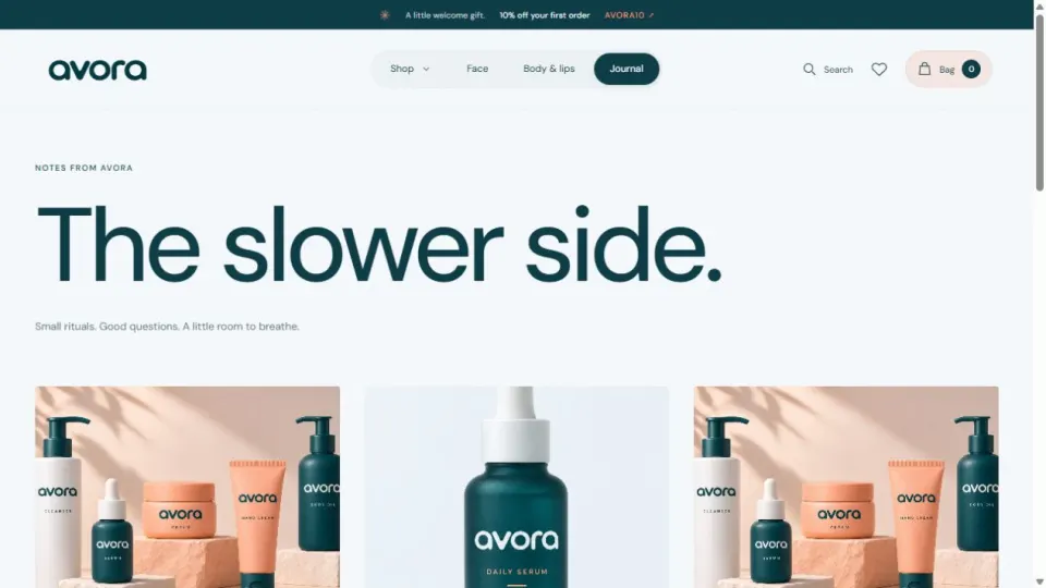
A journal, titled "The slower side", links everyday rituals and ingredient education back to the collection, and lifestyle mockups and a short ritual video put the products in context. Scroll reveals, hover responses and branded loading states give feedback, and they respect the visitor's reduced-motion setting.
How it is built
For readers who want the technical side:
- Next.js App Router, React and TypeScript. Every page is a real route: home, shop, face, body, product, journal, article, bag, favourites, checkout, about, shipping, contact and privacy.
- Reusable components. Product cards, the gallery, ingredient grid, reviews, bag items, the coupon form and the three checkout steps are separate components, so new products and pages reuse them.
- A typed product catalogue. Each product has its category, type, price, size, ingredients and usage in one place, which is what makes ingredient search and filtering possible.
- Prices calculated in whole cents. This avoids the rounding errors that appear when money is handled as decimals.
- Saved bag and favourites. They survive a reload, and damaged or out-of-date saved data is cleaned up instead of breaking the page.
- Automated tests for the saved bag, quantity limits, mixed original and refill items, and coupon totals.
- Pre-built pages on Vercel, so they load quickly and search engines can read them.
What was delivered
- Brand identity: wordmark, colour palette and packaging mockups
- A responsive storefront with 16 products in two categories
- Filters, sorting, ingredient search, quick add and favourites
- Product pages with ingredient education and a refill option
- A review section and review form
- Bag, coupon and a three-step checkout through to review
- A journal, about, shipping, contact and privacy pages
- Reusable Next.js, React and TypeScript components, deployed on Vercel
What comes next
The next stage is to connect payments and order handling, email subscriptions and shared reviews, then replace the sample product and review content with verified data. After launch I would track the product-to-bag rate, checkout completion and email sign-ups to see how the design performs. No conversion or sales results are claimed here, because none have been measured yet.
Product and lifestyle imagery includes AI-assisted mockups. Product formulas, prices, ratings and sales counts on the site are illustrative. The screenshots show the live website as reviewed on 16 November 2026.
Planning your own ecommerce website?
Avora shows what an online store needs whatever it sells. If you are planning one, check your plan against this list:
| What a store needs | How Avora does it |
|---|---|
| A brand people recognise | One wordmark, three colours, the same look on site and packaging |
| Ways to find a product | Categories, filters, sorting and search by ingredient |
| Product pages that answer questions | Photos, price, size, how to use it, what is in it |
| Reasons to trust | Ratings and reviews next to the product |
| A reason to buy today | A first-order discount code |
| A short checkout | Three steps, with the total visible throughout |
| A way to bring people back | Newsletter signup, favourites and a journal |
| A site that works on a phone | Every page designed for small screens first |
Shopify or a custom store?
Avora is a custom Next.js storefront, which gave full control over the design and the shopping flow. That is not the right choice for every shop:
- Choose Shopify if you want to start selling quickly and have stock, payments, shipping and taxes handled for you, with a theme customised to your brand.
- Choose a custom storefront if the store has to look or behave in a way themes cannot, or has to connect to your own systems. It can still use Shopify or another service behind the scenes for payments and orders.
I build both, and I can tell you which fits after a short conversation about your products and plans.
Questions store owners ask
Can you design the brand and build the store together? Yes. Avora was done that way, which is why the packaging, the photos and the website match.
Can you redesign a store I already have? Yes. I start with the product page and the checkout, because those decide whether visitors buy.
What do you need from me to start? Your products, prices and photos if you have them, and a few stores you like the look of.
Want an online store built like this?
I design brands and build Shopify stores and custom ecommerce websites, from the logo and packaging mockups to the checkout. Tell me what you sell and where you are now, and I will reply with how I would approach it.

About the author. Kenil Vaghasiya is a freelance full stack web developer, Framer developer and designer with 5+ years of experience building web applications with React, Next.js, Node.js, .NET and Azure. He works remotely from Surat, India. More about me · Services