An interior design client is about to spend a lot of money on something they cannot see yet. Your website has to show that you have done it before, explain how it will go, and make the first conversation easy to start.
The four jobs of the site
- Present your work
- Explain your approach
- Let visitors explore projects that look like theirs
- Start a conversation
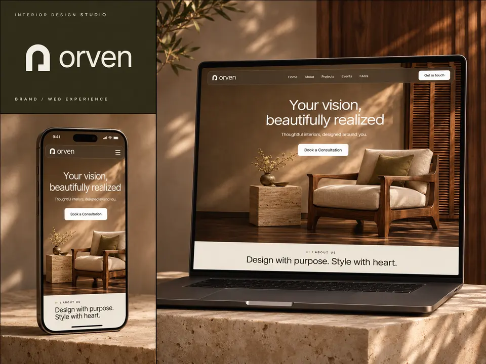
I designed the ORVEN studio website around exactly these four, and every section does one of them.
How to show projects
- Give each project its own page. A single gallery of mixed photos tells a visitor nothing about how you work.
- Lead with the best photograph and keep the text short.
- Say what the project was: the type of home or space, the location, the size and what the client asked for.
- Show a before and after where you have one.
- Group projects by type, such as homes, apartments, offices or hospitality, so visitors find one like their own.
Use real, permitted photographs of finished work. They are the strongest thing on the site.
Explain the process
New clients worry about what happens after they say yes. A short process section removes that worry: consultation, concept, design, sourcing, installation. Three or four lines for each is enough. Say how long a typical project takes and what the client needs to decide at each stage.
Answer the questions clients ask
A short questions section saves you emails and builds trust. The usual ones:
- What areas do you work in?
- How do you charge?
- What is the smallest project you take on?
- How long does a project take?
- Do you work with my architect or builder?
The order of the home page
Follow the order a client thinks in: one large image with a consultation button, a short introduction to the studio, selected projects, journal or press, common questions, then contact. Keep the consultation button visible on a phone without scrolling.
Design choices that suit a studio
- Let photography carry the colour. A quiet palette of two or three tones keeps attention on the rooms.
- Use motion sparingly. Slow, calm transitions fit the subject. Fast effects do not.
- Check it on a phone. Many visitors arrive from Instagram or Pinterest.
The AXIOM architecture concept takes the same idea further with a black-and-white identity, so the photographs supply all the tone.
Which tool
For a studio site I suggest Framer: it is strong on layout and animation, and you can add new projects yourself through its CMS.
Want a site like this for your studio?
I design and build websites for interior designers and studios. Send me a link to your current site or a few project photos.

About the author. Kenil Vaghasiya is a freelance full stack web developer, Framer developer and designer with 5+ years of experience building web applications with React, Next.js, Node.js, .NET and Azure. He works remotely from Surat, India. More about me · Services